Today W3C releases HTML 5.2. This is the second revision of HTML5, following last year’s HTML 5.1 Recommendation. In 2014 we expressed a goal to produce a revision roughly every year; HTML 5.2 is a continuation of that commitment.

This Recommendation like its predecessor provides an updated stable guide to what is HTML. In the past year there has been a significant cleanup of the specification. We have introduced some new features, and removed things that are no longer part of the modern Web Platform, or that never achieved broad interoperability. As always we have also fixed bugs in the specification, making sure it adapts to the changing reality of the Web.

Many of the features added integrate other work done in W3C. The Payment Request API promises to make commerce on the Web far easier, reducing the risks of making a mistake or being caught by an unscrupulous operator. New security features such as Content Security Policy protect users more effectively, while new work incorporated from ARIA helps developers offer people with disabilities a good user experience of their applications.

HTML 5.2 makes the venerable plugin system obsolete. The Web was once extended by plugins – downloaded code with great power over the user’s computer. New technologies or capabilities such as virtual reality or speech interaction are now developed as part of the Web Platform. This allows for better control over potential security flaws, often reduces the cost of development, and enables more focus on the services people want to build than the platform they stand on.

Clarifications and bug fixes bring the HTML Recommendation closer to what has been deployed recently. The definition for the main element has been updated to support modern responsive design patterns, the style element can be used inside the body element. Numerous constraints on code have been loosened, while where necessary for interoperability or security a few have been carefully reinforced. Browsers are encouraged to provide better support for internationalised email addresses that let people around the world write the letters they grew up with, supporting their own language and community.


These are just some examples of W3C’s work to ensure the HTML specification reflects the reality of the Web. There are many other changes large and small in this update, which developers can use with confidence as a reference.

With this update we bid farewell to some of our editing team Steve Faulkner and Travis Leithead, who began as editors of HTML 5.0, Arron Eicholz, who worked on the new code structure for HTML 5.1, and Alex Danilo, who joined when HTML 5.1 was still in development. Their contributions have been important, and they join the many people who have dedicated untold efforts to develop HTML over the years.

Today also sees the First Public Working Draft of HTML 5.3. This was part of our existing plans to produce a new HTML Recommendation in 2018. This week WHATWG announced a new structure, and we are again exploring ways to collaborate with them on HTML. While this means the current plans may change, we remain committed to ensuring that HTML development takes into account the needs of the global community, and that HTML continues to improve in areas like accessibility, internationalisation, and enabling privacy alongside providing greater interoperability, performance, and security.

Sangwhan Moon continues as an editor, joined by Bruce Lawson, Patricia Aas, Shwetank Dixit, Terence Eden, and Xiaoqian Wu to continue the work of updating HTML. Thanks again to Steve Faulkner, who stayed on until now to help with the transition before returning his focus to editing the ARIA in HTML and HTML AAM specifications at W3C. We are pleased to have such a broad-based team, and we believe their strong combination of global experience will help as they work with the chairs, W3C staff, the Working Group and other contributors to meet the world’s needs. While there is always fairly mundane work to do maintaining and enhancing the quality of the HTML specification, 2018 promises an exciting year for HTML, with new features reaching the level of maturity necessary for a W3C Recommendation.


The Web was developed as a platform for everyone, and broad participation in its development, representing the diversity of stakeholders in its success, is vital to keeping it that way. For that reason among others, many thanks are due to all of the 250 or so individuals who contributed to this particular version over the last year. We are also grateful to the people who have already helped move HTML forward with early contributions to 5.3. We look forward to collaborating with many more of you as we continue a key part of W3C’s mission.
The logo design industry is changing at a lightning-fast speed. What was trendy five years ago may not even ring a bell today. As methods of attracting customers become more effective, logo design must keep up the pace. New ideas develop so fast, designers have a hard time following them.
Fortunately, experts are committed to studying short-lived trends and forecasting where the logo design industry is heading. With the help of my team, I’ve put together a list of 10 trends that will dominate 2018.


Form simplification

This trend is all about stripping your design to the basics and making it as clean and minimalist as possible. Advancing internet technologies and cross-platform requirements are among the factors that revived this trend. Your emblem must look good across all mediums, from business cards to websites and mobile apps. This is why some major brands have revamped their logos, giving them a sharper, edgier look. 


Logotype with simple shapes

Legible font coupled with simple geometric shapes (lines, points, rectangles, circles) will continue to hold ground. Having emerged in 2017, this powerful trend is gaining momentum fast. What makes it special?
First, logotypes are known for their simplicity and coherence (think Samsung, Nike, and Google). Second, simple graphic elements give your emblem a balanced, consistent look. Finally, if used wisely, clean geometric shapes can create strong visual effects and elevate your logo among those of your competitors.


Letter stacking

Here’s another hot trend for logotypes. The idea is to place words on top of each other, making long phrases easier to perceive. This trend made big waves in 2016-2017, and it seems like companies can’t get enough of it. Sophisticated and elegant, it will continue holding ground in 2018. Letter stacking works well with contrasting colors. It’s a surefire way to achieve originality and the grab attention of potential customers.


Coats of arms

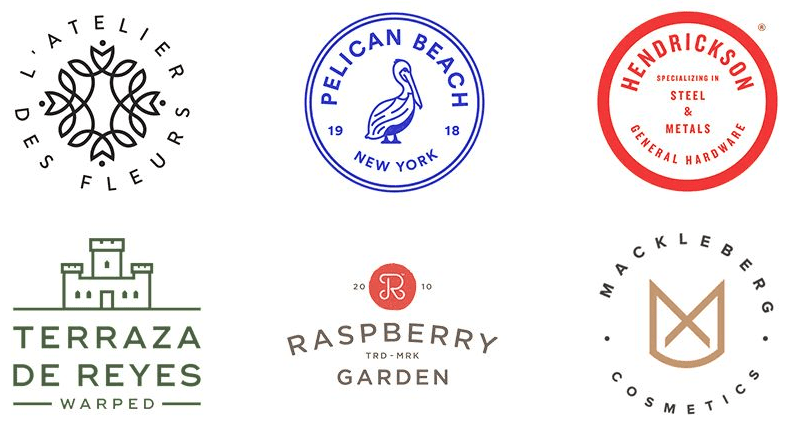
The year 2017 brought us multiple logos imitating ancient coats of arms, emblems, stamps, etc. Text is usually placed inside a circle or semicircle, with dates as a common element. Reserved colors and clear graphic shapes create strong retro vibes. Such logos evoke associations with tradition, heritage, and longevity.


Slices

In logo design, slices are wide parallel lines that seem to make “cuts” in the logo. This trend will become even bigger in 2018, and here’s why. First, slicing adds some air to the emblem, making it easier to absorb. Second, you can use this technique to add smart effects and visual illusion (think negative space). And last but not least, slices give your logo a textured three-dimensional look.


Negative space

This technique does not need an introduction. Logos with negative space have been around for a few years, and 2018 will be no exception. The trend has evolved over the years, shifting from logomarks to logotypes. Now we see more text logos with shapes and images hidden inside or between the letters.


Text as a playground

It looks like 2017 has been dominated by logotypes. As a major branding weapon, typography is far from being fully explored. In addition to the techniques mentioned above, designers have experimented with kerning, spacing, font combinations, and much more. Look at the masterpieces one can create with a bit of imagination! Are we going to see more of these graphic delights in 2018? You bet!


Gradients and color transitions

Graphic designers rediscovered the power of gradients in 2016-2017, but the trend won’t fade away anytime soon. Color transitions can be successfully applied to both icons and text, especially for a massive, bulky font.


Overlaps

Overlaying vibrant colors creates a brand-new hue, giving depth to your design. MasterCard’s recent logo overhaul breathed new life into the technique, proving that it fits all kinds of brands, including high-profile companies.


Lettering

Although it’s being replaced by minimalist trends (like those discussed above), lettering still holds its position. A plethora of industries, including cafes, barber shops, and photo studios, will continue exploring the power of this trend. Prepare to see more logotypes with intricate inscriptions!


That’s it! Covering all the popular techniques would take forever, but these are the top 10 trends you need to look out for in 2018.
  • Add to Phrasebook
    • No wordlists for English -> Gujarati...
    • Create a new wordlist...
  • Copy
Image result for miui 9
Keeping up with the software update cycle, Xiaomi is now rolling out  Nougat-based MIUI 9 for many devices. The company has announced a list of 40 smartphones that will be getting updated to MIUI 9. Xiaomi confirmed the news on its official Weibo account. The list includes a majority of devices that were launched in 2017, and some that were launched as early as 2012.


Xiaomi had announced MIUI 9 back in July, and it brings some notable improvements. MIUI 9 brings split-screen feature which allows you to run two apps side-by-side. It also has universal search for images based on keywords like location, expression, and documents among others. Xiaomi has also integrated an AI Assistant on MIUI 9, which it says is smart enough to ‘find anything and everything’. MIUI 9 also has app suggestions based on on-screen content. For example, MIUI 9 will suggest Google Maps if you’re chatting about locations

    Many of Xiaomi’s most popular devices are on the list
     Xiaomi will update 40 of its devices to MIUI 9, the latest version of its Android skin.
     MIUI 9 runs on top of Android 7.0 Nougat


Software updates are important for many people. In addition to new features, they bring bug fixes and security updates too. One of the drawbacks of buying cheaper devices is that they receive fewer updates than flagships. But that isn’t the case for every company.

Xiaomi produces a ton of devices that range from flagship prices to under $100, and the company just announced that it’s updating 40 of them to MIUI 9.


Because MIUI 9 is so heavily customized, it generally takes Xiaomi longer to push core OS updates. That’s part of the reason MIUI 9 is still based on Android 7.0 Nougat, a 17-month-old version of Android. MIUI probably isn’t going to win over pure Android fans, but it has developed a loyal following for a reason.

Here’s the complete list of devices that will be updated to MIUI 9:


Mi A1   
Redmi 5 Plus
Redmi Note 4X
Mi Note 3
Redmi 5A
Redmi Note 4
Mi Max 2
Redmi 5
Redmi Note 3
Mi MIX 2
Redmi Y1
Redmi Note 2
Mi 6
Redmi 4
Redmi Note
Mi Pad 3
Redmi 4A
Mi 5c
Redmi 4 Prime
Mi MIX
Redmi Pro
Mi 5s Plus
Redmi 3x
Mi Max
Redmi 3s
Mi Note 2
Redmi 3
Mi 4s
Redmi 2A
Mi Pad 2
Redmi 2
Mi 4c
Redmi 1S
Mi 5s
Mi 5
Mi Note
Mi 4
Mi Pad 7.9
Mi 2s
Mi 2